
In preparing to roll out a website for the first Virgin Hotels property, which opened in Chicago, in 2015, Doug Carrillo kept the Virgin brand—known the world over for its airline, mobile service and, of course, founder Richard Branson, top of mind.
With “surprise and delight” the brand’s core values, Carrillo’s goal for the website followed a similar approach: “fun and cheeky, very simple to navigate, very straightforward, but at the same time very striking,” Carrillo, Virgin Hotels’ VP of sales and marketing, said.
He opted for the same cherry-red hue linked to the brand (also prominent in the Chicago hotel’s décor, right down to the mini-fridges in the guestrooms), and studied non-hospitality sites for inspiration, wanting to dig deeper into lifestyle and move away from traditional hospitality websites.
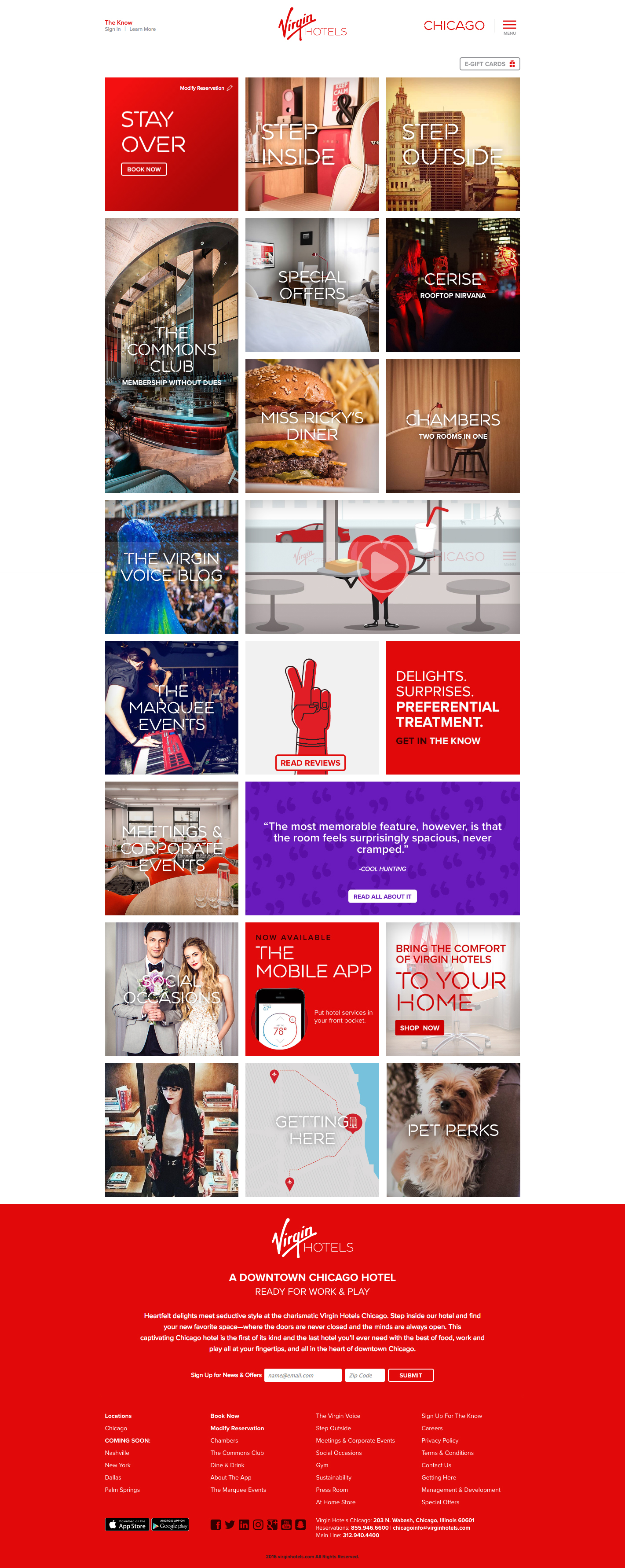
For the hotel sector, “What Richard has created are customers that are great ambassadors and are attracted to a mindset, regardless of age,” Carrillo said, citing a guest demographic of 48 percent Generation Xers and 34 percent millennials. The tile-format website “gives us a lot of flexibility to promote campaigns, to bring them front and center,” he said. A “call to action” for booking a stay is easy to find on the home page, too. Carrillo said he plans to employ similar techniques when creating websites for future Virgin Hotels properties in Dallas, New York, Palm Springs, Calif.; Nashville, Tenn.; and Silicon Valley, Calif.—all expected to be open by the end of 2019.
Mimicking Matters
For branded hotels, a website that closely replicates the guest experience is a smart move that can go a long way to engaging the guest even before he or she arrives at the hotel. Consider the JW Marriott brand. “We embody our brand values of authentic, crafted and intuitive and our website strategy captures that to the core,” said Michelle Klein, sr. marketing manager at the JW Marriott Indianapolis, which launched its new site last March. “Our goal is to provide a site that authentically reflects the surroundings of our environment, great service and a great design, and the intuitive nature of ‘less is more.’”
Similarly, Hotel Indigo wanted to push its “The Color of Discovery of Campaign” (the art of identifying authentic, locally rooted moments, often in surrounding neighborhoods) through its website. The December 2015 campaign launch, promoting the idea that no two Hotel Indigo properties are the same, despite it being a chain, now folds in all hotels.
The microsite (discovery.hotelindigo.com)—a content hub with tabs for interest areas like “Food and Drink” and “Music” in specific cities—debuted in April of this year. “It’s the heart and soul of the Indigo brand…a catalyst to these neighborhood experiences,” said Jason Moskal, VP of lifestyle brands for InterContinental Hotels Group. “The content hub is a means for us to tell the story of that brand.”
Whenever possible, content is authored by hotel staff, tapping into the expertise of influencers of locals if needed.
The Indie Way
Two boutique independent hotels in Illinois had no brand dictate when launching their websites in the months preparing for opening day. At The Deer Path Inn, in Lake Forest, Ill., which reopened in early 2016 after an extensive renovation, GM Matt Barba wanted to retain the Old World vibe—even on the website. Jewel tones, a traditional script font and British English terminology are used. This mirrors what’s on property, such as Barba’s title of “innkeeper” and using “English Room” for dining room.
“We like to think we practice the art of innkeeping,” he said, pointing out that the guest demographic tends to be split among Anglophiles, botanical enthusiasts and those interested in architecture.
“We say ‘Cheers’ a lot—verbally and in written form. We try to put that on the site so you get a little bit of the flavor before you get here,” said Barba, adding they try and steer clear of “crossing the line to kitschy.”
Similarly, The Godfrey Hotel in Chicago, which opened in 2013 and has a sister property in Boston, strives to target travelers between their late 20s and early 50s through its website. “In the sense of website design, less is more,” said Adam Schomaker, the hotel’s director of sales and marketing, who names excessive scrolling as one of the elements not found on the site.
Because he had the advantage of launching the brand and website all at once, he started with the logo and built that out to brand articulation, choosing colors and the position on its website. Blues, greens and reds with gradient qualities are on both the website and throughout the hotel. “It’s a little more welcoming to the eye,” explained Schomaker. “With the toned-down colors it also has that luxury-lifestyle feel.” Forty-two different two-letter elements modeled after the periodic table of elements were also dreamt up, such as ZZ for the “Don’t Knock It” door hanger guests can place outside their rooms. These also appear on the site.
These same practices can be employed when launching a microsite, which is what Kevin Scholl, digital marketing director for the Red Roof Inn brand, did earlier this year. The site GoMoreGoBetter.com mirrors Red Roof Inn’s philosophy of offering low rates so guests can spend more on experiences nearby. Travelers are invited to take and post photos to the site. “We have all become content creators. We wanted to give our audience and community a place to share that content,” said Driscoll. “We had a whole new audience of people who might not have known about us as a brand.”